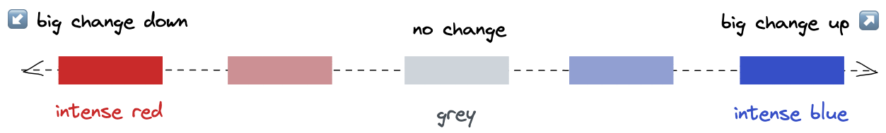
The dimension heatmap provides a visualization of how the metric - sliced by each dimension - changes when compared to a baseline. By default, the baseline is one week before the anomaly period. The figure below shows an example of dimension heatmaps. The metric has 15 dimensions. Each row represents one dimension, and each cell within the row is a dimension value. The size of the cell is proportional to the number of observations having the cell value. It is called contribution. For instance, for dimensionDocumentation Index
Fetch the complete documentation index at: https://docs.startree.ai/llms.txt
Use this file to discover all available pages before exploring further.
assignees, around 90% of the observations have the value <EMPTY_VALUE>(^1)
When there are too many small values, they are grouped into a “OTHER” category.
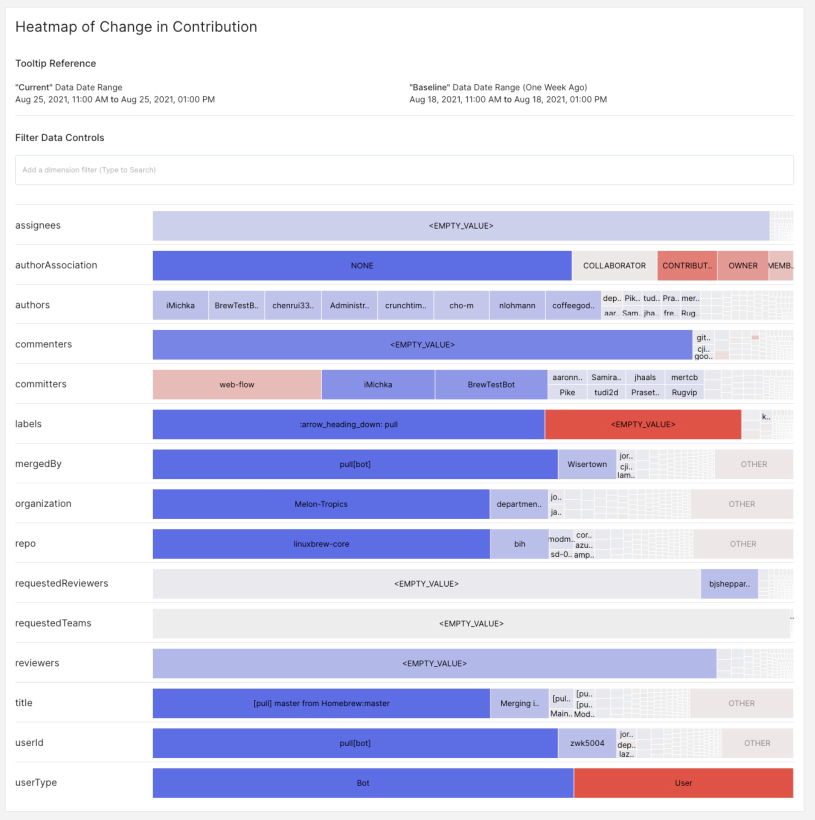
userType, in the baseline, Bot dimension represents 20% of the traffic. In the current observations, Bot represents 50% of the traffic. This is a +30%pp change. Bot is deep blue.